
Websites & support / Behind the scenes
Merlin Scooter Club: giving a Derby club its own place online
A scooter club’s visitors may want photographs, club history or a way to get involved. The site should feel like the group they are trying to find.
We built Merlin Scooter Club’s website. Its public pages describe a Derby club established in 1981, with the history and scooter culture informing the design.
Let the club’s own identity lead
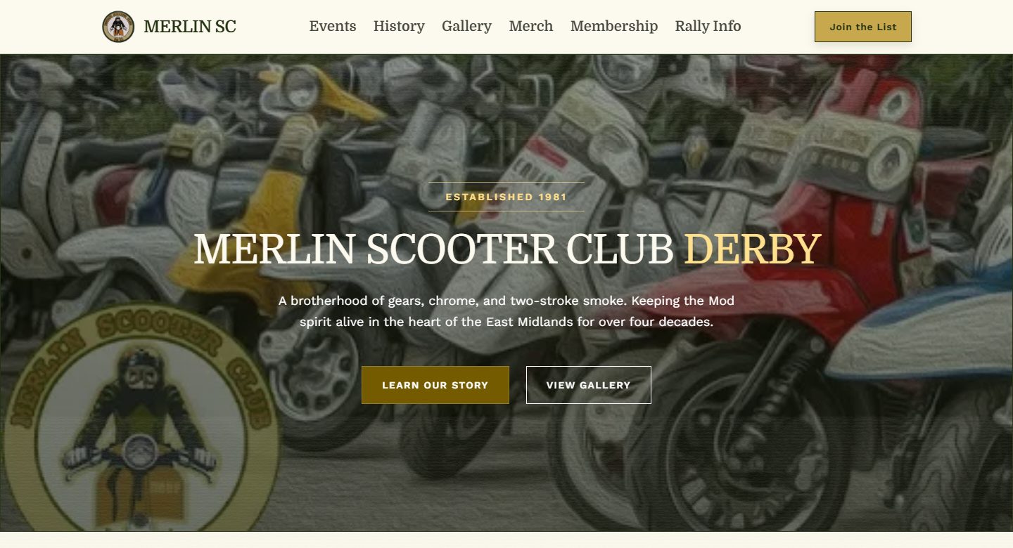
The homepage leads with the Merlin name, Derby and scooter imagery. Its cream, dark green and gold treatment has a different feel from a corporate brochure. Visitors can open the club story or gallery directly from that first screen.
That is the interesting design question for me: what should this particular website feel like? A club built around a shared interest needs something recognisable to the people who care about it. The photographs and working language give the design material to use.
I would keep those choices connected to readability. A strong visual identity still needs legible headings and links that somebody can use on a phone.
Give members and newcomers somewhere to go
The public navigation separates events, history, gallery, merchandise, membership and rally information. Those labels reflect different reasons for arriving. An existing member looking for club information does not have to begin at the same point as somebody learning about Merlin for the first time.
A gallery is particularly useful for a club whose subject is visual. It lets people see the scooters and the character of the group. History gives that material context, while membership provides a next step for somebody interested in joining.
Give somebody responsibility for the dated information. History and photographs can stay useful for years, while an event page needs attention as soon as the arrangements change.
 Flying PenguinFrom the workshop
Give members and newcomers a route
A community website needs room for its character.
Give the club one address people can keep
A club can use social channels and still benefit from a website that brings the important information together. The public pages give somebody a stable address to share when a question comes up about the club, its history or how to get involved.
That matters when information is otherwise spread across individual posts and conversations. A website can organise the enduring material into pages, leaving current updates with the people responsible for them.
For a club project, I would decide who keeps each section current and make the editing process part of the handover. The public navigation only stays useful if somebody knows how to update what sits behind it.
The smaller controls deserve attention too
A bold opening is the part people notice first. The useful work continues in the menu, gallery controls and forms. Members may be using a phone outdoors or returning to a page after following a link from elsewhere.
The delivered work on this site has included refinements to typography, mobile navigation, gallery controls and form usability. Those are practical parts of keeping a club website usable as its content grows.
When I look at another club site, I would try a few ordinary journeys: open the gallery, find the club history and reach the membership information. Each should make sense without somebody standing beside the visitor to explain it.
Take a look around
Merlin’s design starts with the club’s own subject and leaves room to explore the history, photographs and membership information.
If you run a club or local group, list the questions you answer repeatedly and the material members most want to see. Put those beside a few photographs that represent the group. That is a good starting point for deciding what its website should contain.
Sources
Checked on 23 October 2026.
- Merlin Scooter Club: public website
The club’s own description, Derby identity, stated founding year and public page structure. Screenshot shows the public homepage, not member records.
- Flying Penguin: our work
The Merlin Scooter Club build in our public portfolio.