
Websites & support / Behind the scenes
Chlo Mo: helping a visitor choose how they want to train
The Chlo Mo website has a section called Ways to train with me. Its four cards are a useful starting point for looking at this build: studio personal training, a gym-confidence series, online coaching and workout plans.
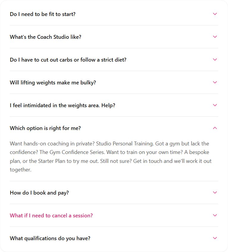
We built and maintain Chloe’s website. The service cards have a useful companion in the FAQ: a direct answer for somebody who is unsure which option to ask about.
Give each way of working a clear place
The cards use a common layout, with a separate heading and short explanation for each option. A visitor can read across the offering before following up on one particular service.
The descriptions distinguish private studio sessions from support for training elsewhere. That is useful context for someone who knows they want help but has not yet decided how they would like to work with a coach.
I want a service page to make that first comparison manageable. The page can explain what each option involves, leaving the individual conversation to deal with the person’s circumstances.
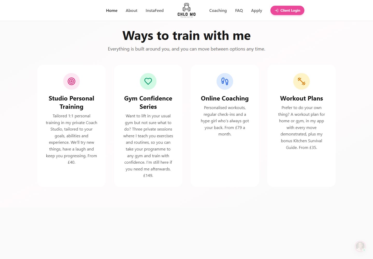
Source: Chlo Mo: current public website
Let the FAQ carry the decision further
The FAQ includes a question about which option is right for the visitor. Its answer relates the choices to how someone wants to train and leaves a contact route for anyone still unsure.
That is a useful second explanation. The service cards introduce the menu; the FAQ approaches the same choice from the visitor’s point of view. Someone can arrive with an ordinary question rather than a product name.
Keeping that answer beside the other common questions gives it a clear home. Someone returning to the site can find the explanation again through the FAQ link in the navigation.
Keep a conversation available
The public navigation gives coaching and FAQ their own places alongside the application route. Someone who needs more explanation can keep reading before deciding to make contact.
A small business does not have to force every visitor into the same decision immediately. Some will recognise the service they want from a card. Others will need an answer or a conversation first.
This is where I like the page structure to do useful work. Keep the names consistent, connect the explanations and make the next step clear. As the offering changes, the cards and the relevant answers need to change together.
Use the questions behind your own services
For your own website, start with the questions people ask before working with you. If several services sound similar to a new customer, explain the difference in the service descriptions and give the common question a direct answer.
Bring those questions when we plan the site. They help us decide what belongs on the first page and where a fuller answer will be useful.
Sources
Checked on 23 October 2026.
- Chlo Mo: current public website
Current rendered coaching cards, navigation and introduction to Chloe. The footer credits Flying Penguin for the website build and maintenance. Current rendered content checked on 23 October.
- Chlo Mo: public frequently asked questions
The service-choice question and its expanded answer, read and captured on 23 October. No private account, application or purchase was used.