
Websites & support / Behind the scenes
DGFwash: helping a customer choose the right valet before they book
DGFwash provides mobile valeting and detailing across Derbyshire. We built and maintain its website. For this look at the site, I want to start with the packages: they explain the choices a customer has before the booking starts.
Someone looking for an exterior valet may know exactly what they want. Someone considering paint correction may need to read more. Both visitors arrive at the same website, so the page needs to make those differences easy to find.
Start with what the customer wants done
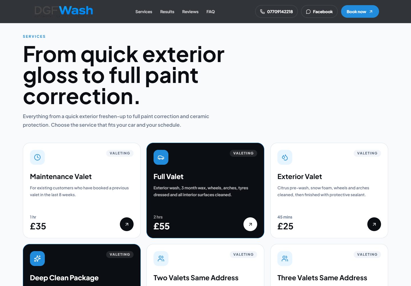
The service cards group the offering under valeting, paint correction and protection. Within valeting, the page describes options including a full valet and a deep clean. Each card gives the visitor more to go on than the package name alone.
I like a service list that lets somebody recognise their own situation. A person wanting the inside of the car cleaned can read what a package includes, rather than trying to guess from a broad label such as detailing.
The page also explains that its maintenance valet is for existing customers who have had a recent valet. Putting that condition beside the service helps someone decide whether it applies to them before they leave for the booking page.
Source: DGFwash: public website
Give more involved work its own explanation
Paint correction and ceramic protection have their own cards. They sit within the same service layout, but the descriptions explain a different kind of work from a routine valet.
That distinction is useful in a specialist business. The owner knows the difference between the services; a new customer may only know what they want the car to look like. The website can help that conversation by describing the work in ordinary language.
There is still a place for asking a question. The phone and Facebook routes stay visible alongside booking, so a visitor can contact DGFwash if they are unsure which option fits their car.
Make the move to booking clear
The site’s booking links lead to Setmore. The website explains the service range, while Setmore provides the external booking destination. A visitor can use the package information as a starting point for choosing there.
When I plan this kind of journey, I want the customer to understand that next step. They should know whether they are about to pick an appointment or send a question for someone to answer.
The package descriptions need to stay consistent with the booking service as the offering changes. If the business renames a valet or changes who can book it, both places need attention.
Source: DGFwash: public website
Use the design to make the choices readable
DGFwash uses blue accents with black and white panels. The service cards carry category labels, descriptions and a clear onward arrow. The repeated layout makes it easy to compare the information in each card.
The page also states that this is a mobile service across Derbyshire. That is practical information for somebody deciding whether the offering suits them; it belongs near the service introduction.
This is work I enjoy on a small-business website. The business has specific services to explain, and the design has to give those details enough room. A useful card is one that helps somebody make sense of the choice.
Sources
Checked on 23 October 2026.
- DGFwash: public website
Current service categories, mobile coverage, package descriptions and Setmore booking links. The footer credits Flying Penguin for the build and maintenance. Screenshot captured on 23 October.